The Raven by Edgar Allen Poe | Three Different Designs
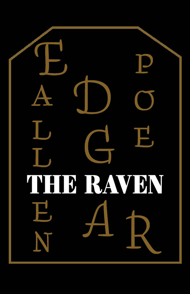
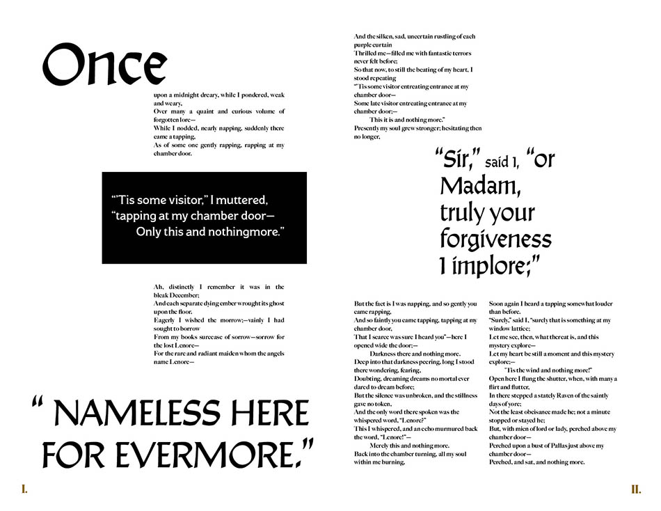
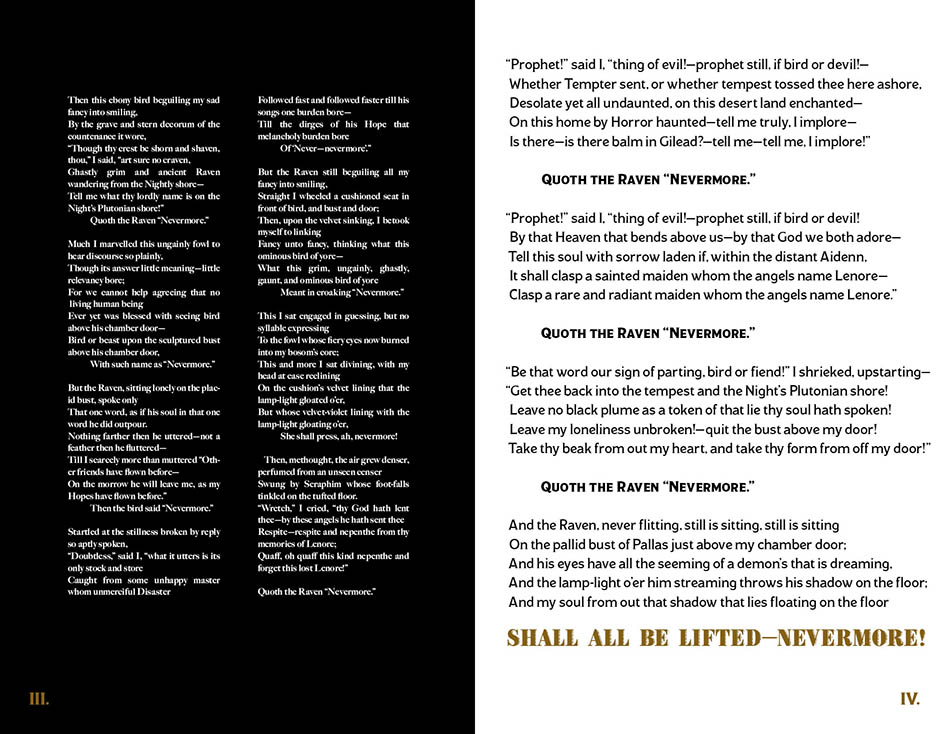
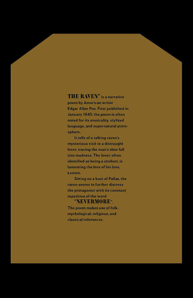
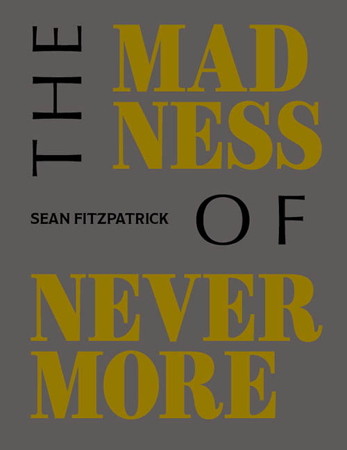
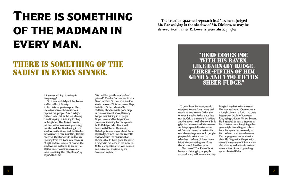
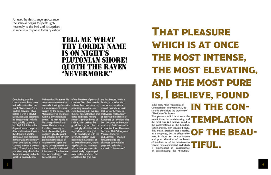
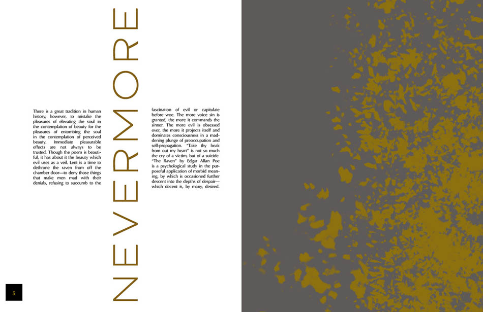
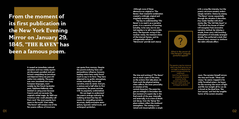
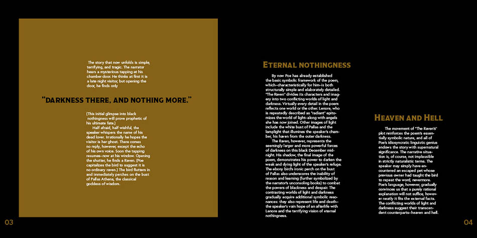
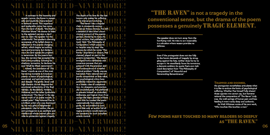
For this project, I was instructed to choose three articles or writing that talked about the same topic. However, what I had to do creatively was to make each layout different in appearance (page size, color, length) while maintaining a relationship between them through the structure (typography, grid system, layout, color etc). I was not allowed to use any images, so I had to rely on layout to make these three designs cohesive. For the three pieces of writing, I chose the original text of The Raven, a critic of the poem, and an analysis of the poem.
The Process
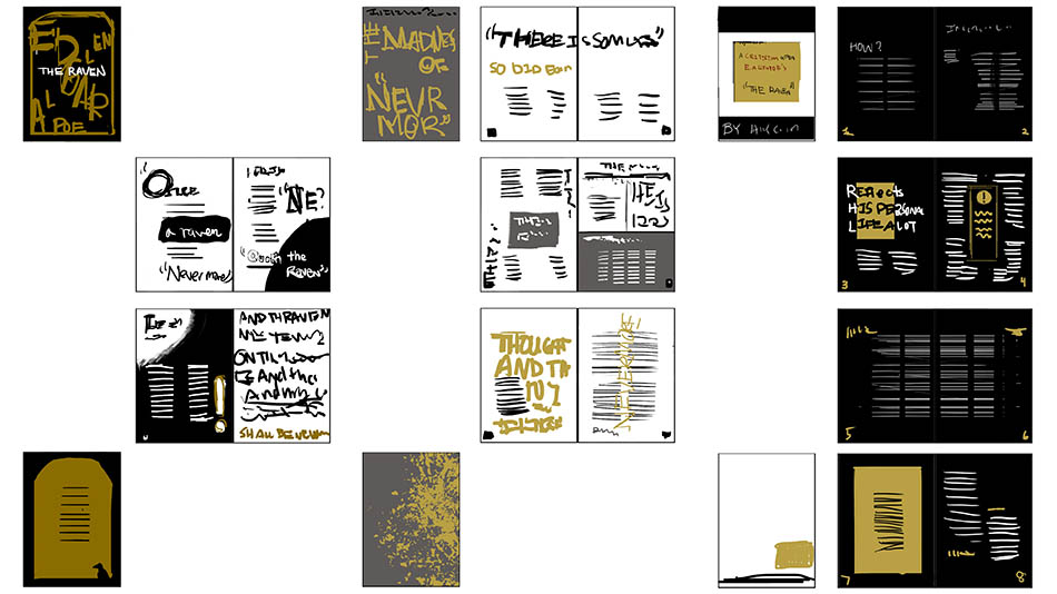
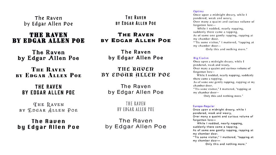
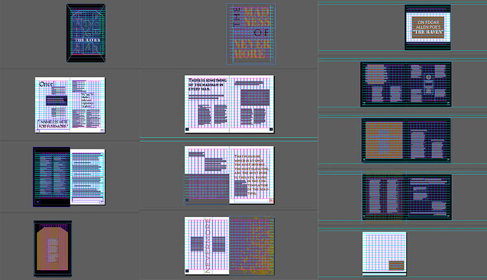
The writing of Edgar Allen Poe is mysterious, thrilling, and romantic. To capture the essence of the Raven, I decided to go with a dark color palette that is highlighted with gold accents. I leaned towards more serif typefaces and chose more vintage and gothic-inspired typefaces for heading. Although the sizing of each layout was different. I used a grid system of 12 grids. I was the most experimental with Layout 1 and used more serif typefaces to represent the poem better in a whimsical nature. For Layout 2 and Layout 3, I aimed to be less abstract and introduce more order to the spreads because both are more analytical articles that require more formality in the presentation.
